Building this website January 27, 2021
This website was built using gatsby, mdx, and bulma. This is a discussion on why.
Building this website January 27, 2021
This website was built using gatsby, mdx, and bulma. This is a discussion on why.
TALOD Vertex Reduction November 21, 2002
What if we could dynamically change the level of detail for 3D objects? A Hardware-optimized dynamic LOD method.
Years 1995-2001 January 01, 1995
Games, Multimedia, Accounting, Graphics, and Visualization projects
IonCreation January 01, 1992
A platformer game written using Microsoft QuickBasic 4.5 for MS-DOS. Download and play it using DOSBox!
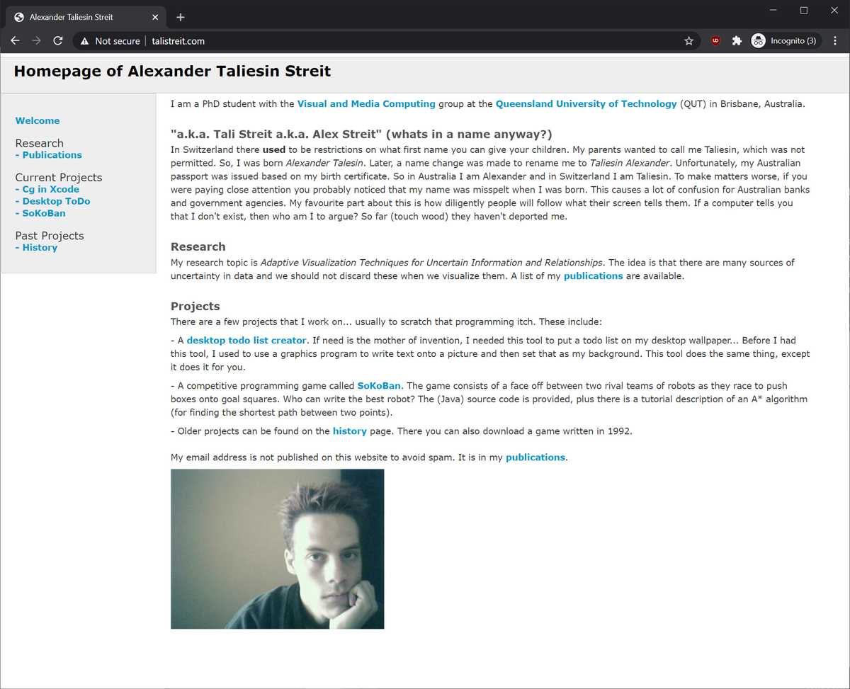
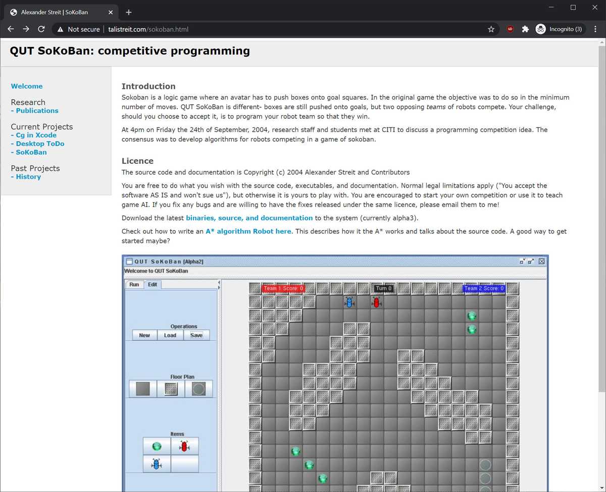
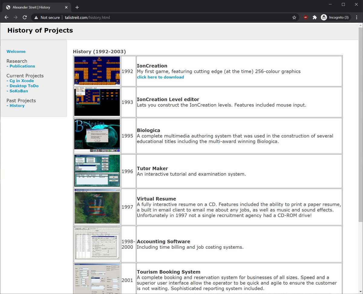
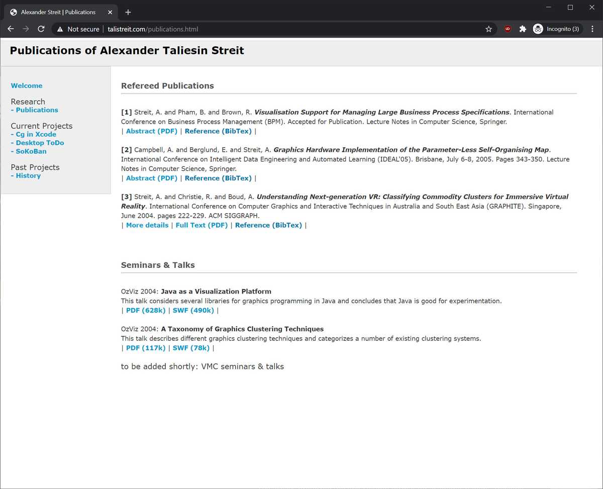
Back in 2005 I hand crafted HTML pages and a CSS stylesheet. It worked and the site was fast to deliver but not necessarily the easiest to update. I wasn't very satisfied with content management systems, because the site rarely changed and the slow down for visitors seemed like a trade off that wasn't worth taking.
|
|
|
|
|
|
Thus the site slowly stopped being updated. What I really wanted was a content management system that I could edit and update, but would deploy to static HTML for serving. Much like a compiler produces exectable code, it felt like there should be a "compiler" for generating HTML pages.
It's 2021 and as I was looking around, I came across Gatsbyjs, which seemed to do exactly what I had wanted. Gatsby isn't a content management system, rather it is a framework that lets you roll your own. It takes the site that you create and builds it to static files that you can then upload directly to your web server. Why use it?
gatsby-plugin-sharp optimizes imagessass etc.I wanted to make the site mobile friendly. Bulma is a CSS framework that has nice responsive support. The caution with using a framework is that your site can end up looking "more like everyone else than anyone else".
I've always preferred the two-column format for academic papers. Thinking about web pages, it seemed that a two column format would make more sense. Initially I thought about having the content spill over two columns. However, that would be awkward to read, because visitors would have to scroll back up to the top to read the second column. It would look great on mobile where you can just scroll through it.
This is how we ended up with the site's current design, where on a wide screen the left column is one level higher on the tree. On mobile you didn't need to see the left page and so it is hidden on a portrait display.
MDX is markdown that allows JSX in it. It's like having the best of both worlds because
you get the convenience and legibility of markdown, but the power of JSX when needed. The
gatsby-plugin-mdx plugin allows you to annotate mdx files with frontmatter. These are
fields that can then be used in graphql queries. While this is incredibly convenient for
a blog style site like this one, it doesn't seem to scale at all as the frontmatter isn't
scoped. That means, for example, if image is an image object type in one mdx, it can't
be a different type in another mdx file, even if those mdx files come from different
sources.